Historic roots and inspired futures.
Transforming a storied building into a state-of-the art college campus.
Capabilities Applied:
Install & Beyond:
A historic Eastman Kodak factory building in Rochester was transformed into an innovative new urban campus for Monroe Community College, in part thanks to the brand building and effective wayfinding provided by Takeform. We worked across seven floors of a 20th-century building to bring in a student-centered, 21st century vibe.
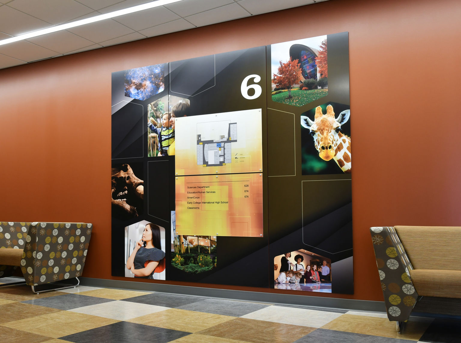
The urban campus is the result of an exciting collaborative engagement that involved students, faculty, employees, county staff and project partners. We wanted to elevate and honor the collaboration and further the brand storytelling in every touchpoint from the main entrance, lobby and stairwell to the wayfinding signage throughout the space.
Working with industrial elements and wood, metal, and glass finishes, the warm color palette and sophisticated lighting had our teams feeling as inspired as the students and educators who'd soon walk MCC's halls.
Where:
Rochester, New York
Contributors:
Heather DeMoras Design Consultants
Capabilities Applied
Experiential Graphic Design
In close discussion with the client and the interior design firm, Heather DeMoras Design Consultants, we came to understand the MCC brand, their vision for the campus and the critical need to inspire students and root the new campus in visuals inspired by Rochester.
Engineering
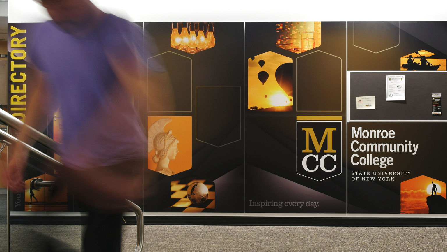
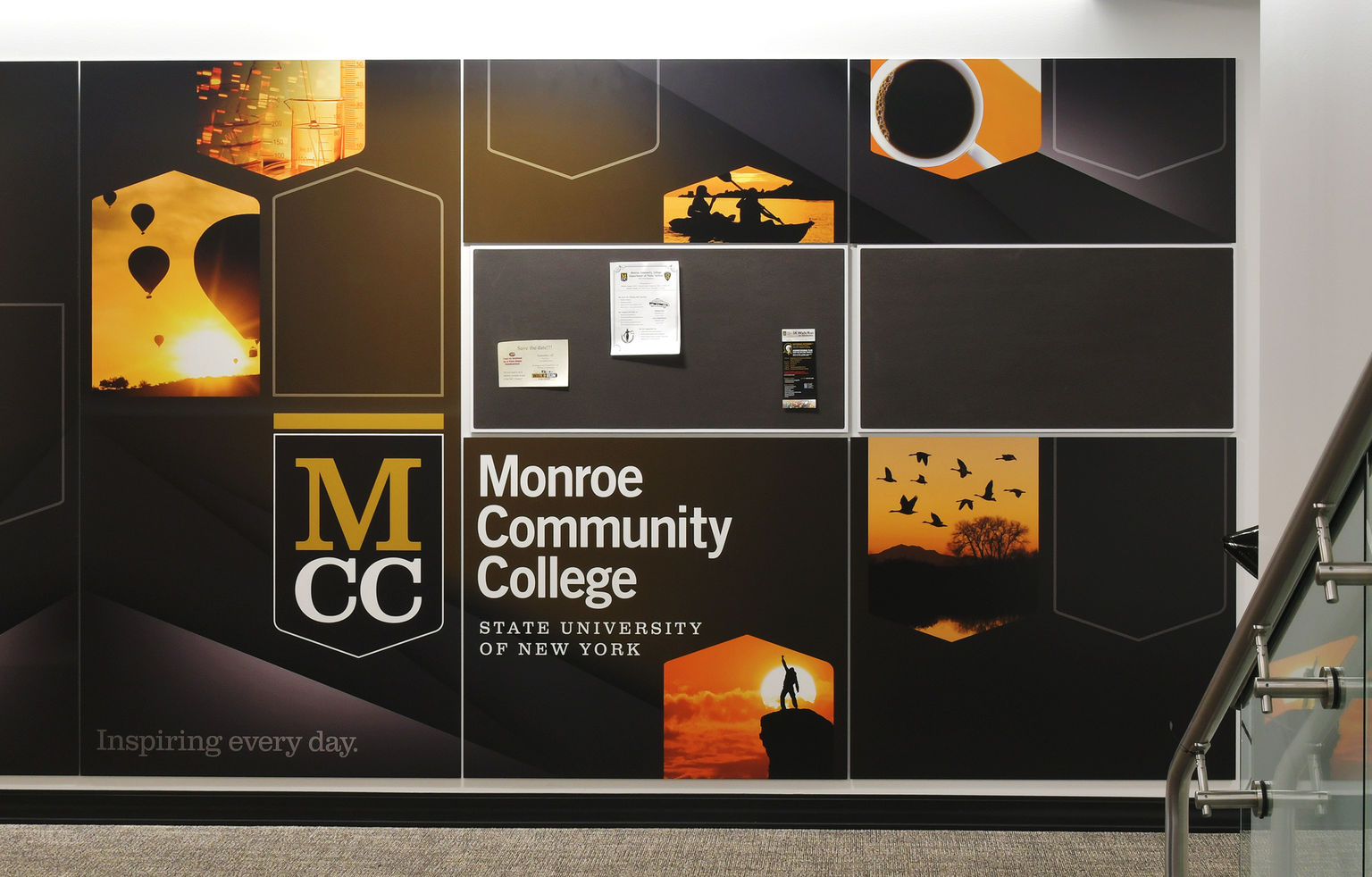
Wall displays at MCC involve careful integration of tackboards and notice holders into the graphic panels systems for a cohesive feel. Overhead graphic panel installation above the main staircase was a unique challenge that required careful planning.

Manufacturing
The MCC campus features multiple Takeform product lines, so we worked to ensure on-brand consistency across all manufacturing touchpoints. The campus's large scale graphics feature photographs that called for precision printing across a diverse variety of materials and substrates.
Products
Dimensional Logos and Lettering | Ethos
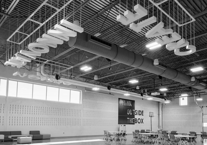
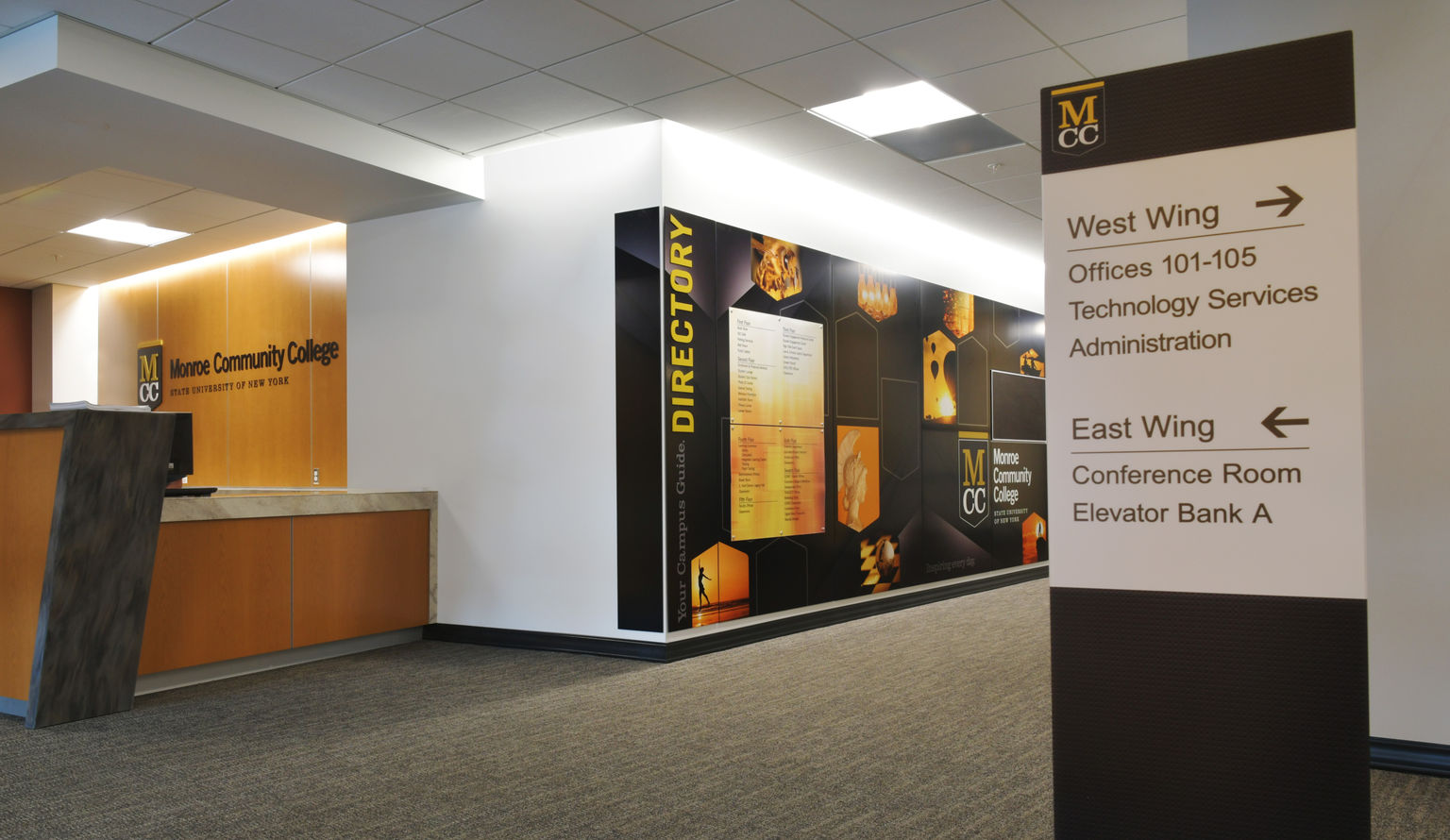
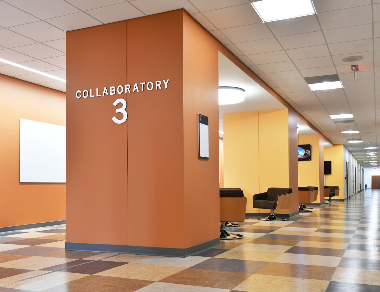
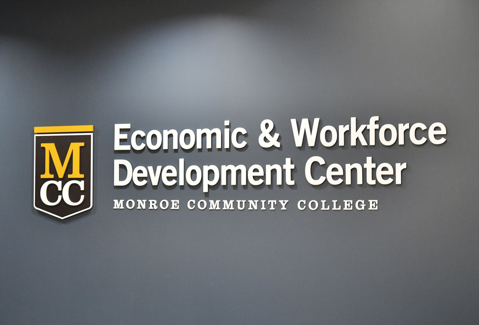
Communicating credibility and campus-wide pride loud and clear was a priority for MCC. A dimensional logo treatment backed by a rich wood finish – and from our Ethos line – sets an elegant stage at the main lobby reception area. Then, key areas of connection and flexible work, dubbed "Collaboratories" are called out in common areas of each floor with satin silver dimensional letters.
Graphic panels | Moxie
A Moxie white-on-white brand statement sets the tone above the main staircase at MCC. A distinctly urban college campus, we leveraged Moxie graphic panels to bring the Rochester skyline indoors, connecting the community and spanning two auditorium entrances. More inspiring graphics and messaging, celebrating the region and building MCC pride are found in big, bold level indicators in each elevator corridor, brand installations adjacent to the main entrance and throughout common campus areas.

Signage system | Vivid
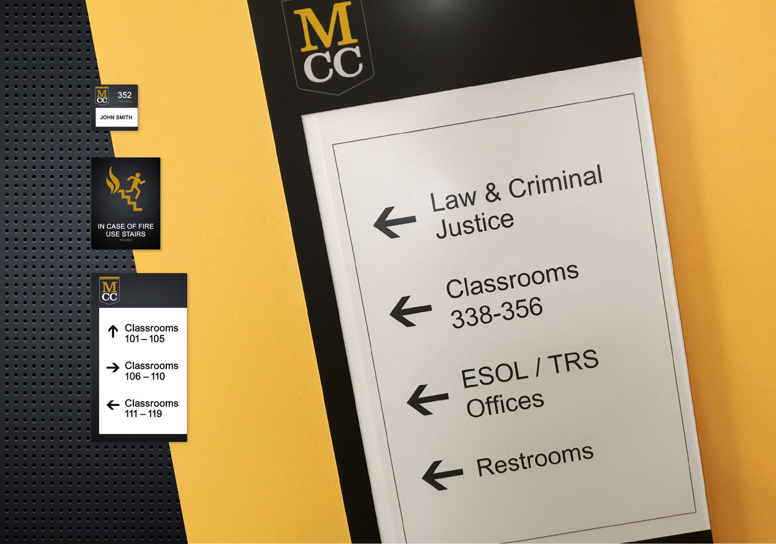
An expansive, high-traffic, seven-floor space demanded a clear room signage and wayfinding system for MCC. The energy of a college campus making a name for itself required that the signage be relevant to the brand and students. Enter Vivid and its direct-print signage platform. We designed a contemporary graphic texture with simulated lighting effects, as intricate as it is durable, as impactful as it is easy to clean. Campuses are dynamic by nature, so Vivid's changeable inserts keep things up to date and ready to grow.

LEED Signage | Vivid
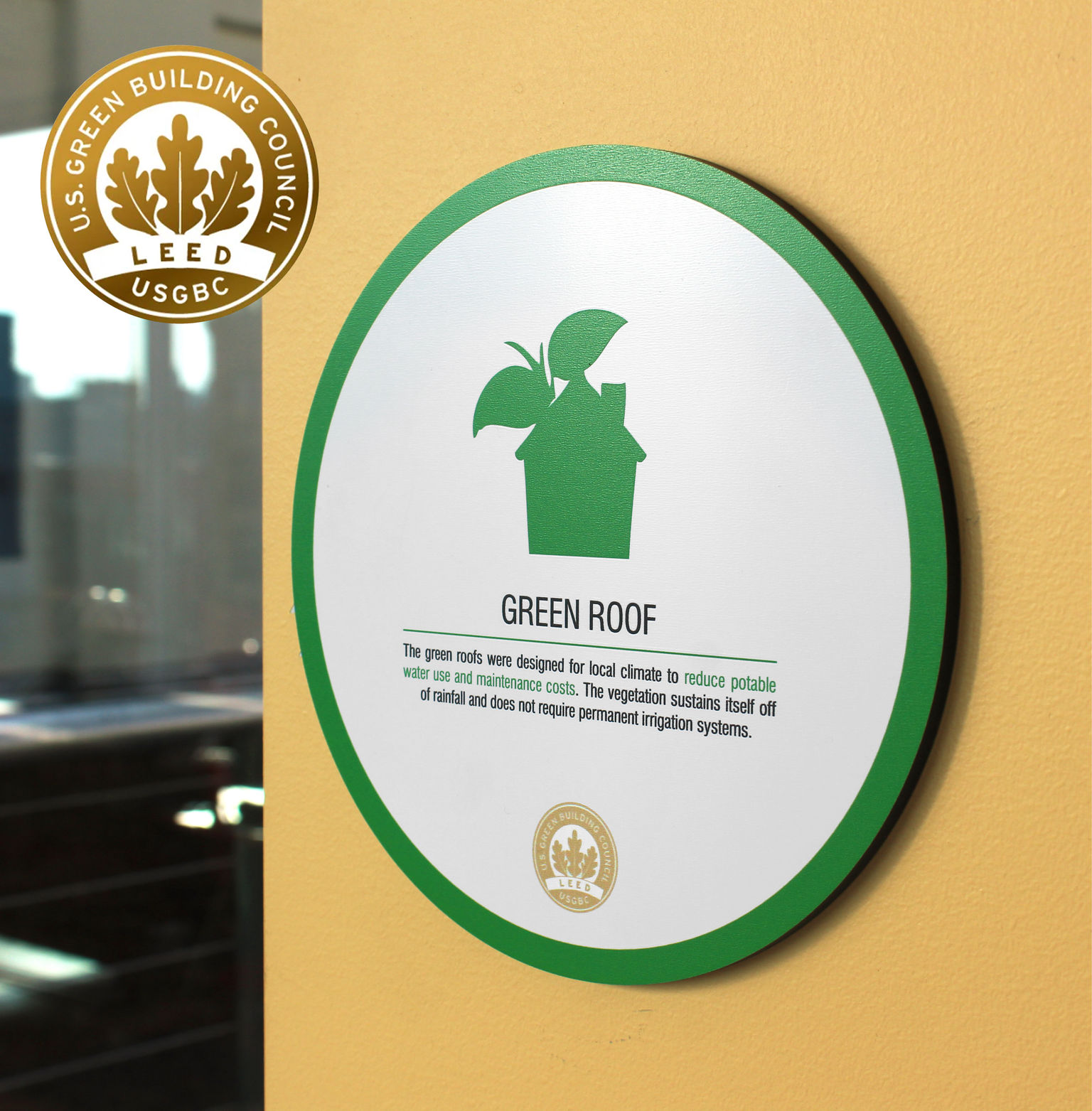
MCC has an especially strong environmental focus. LEED-inspired signage from our Vivid line makes that connection clear by communicating sustainability facts, sharing personal action opportunities, and identifying environmentally-focused features present across the facility.
Integrated tackboards and notice holders | Additions
Timely messages can be found quickly, thanks to intentional communication zones around MCC featuring Additions displays. Tackboards and notice holders reduce clutter and are smartly integrated into the graphic panel system for added brand cohesion. Thanks to Additions, students and staff stay up on all the events, activities, and organization news that make a campus come alive.
Install & Beyond
Installation
There's always anticipation of the first day of school, and MCC’s opening drove the anticipation higher with tight installation deadlines. We worked in lock-step coordination with other product installers to bring our product in on time closely after their work wrapped. For installations requiring heavy lifts to get installers into overhead positions we also needed to protect already-installed flooring with hundreds of feet of plywood leading from entry to installation points.
Ownership Services
Staffing and course offerings are just some of the changes a campus can expect year to year. Through our Ownership Services program, MCC is confident we'll be there for MCC whether it's to keep signage up to date or address new needs down the line. Recommendations from our periodic site assessments keep signage and graphics at the top of the class.
